
Association Anywhere—Version 8
Overview:
- Company: ACGI Software
- My Role: User research, interactive prototyping, interaction design, visual design, user testing
- Collaborators: Greg Reich, Head of Product. Alan Moore, UX Developer. Also, a ton of great developers on the ACGI Team.
- Technology: Oracle Database
When working at ACGI, I glazed a lot of eyeballs whenever I told someone what I did for a living. After running through the usual “What’s a UX design?” I would explain what ACGI does—making association management software.
Professional associations have similar needs to other businesses or organizational bodies, but they typically do so with few resources and with a deep need to connect together information usually held in silos. ACGI creates the nerve center for these organizations, a sprawling product called “Association Anywhere” that manages almost every aspect of an association’s existence.
Our task was to launch the 8th iteration of Association anywhere, a complete overhaul of the system’s user facing navigation. We had from when I was hired in August until the user conference that next Spring.
Note: ACGI doesn’t release screenshots of their system publicly, so you aren’t going to see any here. Sadly, this means all of my design work too.
Evaluation
When I started at ACGI, we had a navigational prototype that had been languishing since it was built. It was a complete fresh start, collecting together a lot of various types of navigation from throughout the system into a single tree structure. It was a huge improvement just through consolidation—new users now didn’t have to memorize the location of individual levels of navigation.
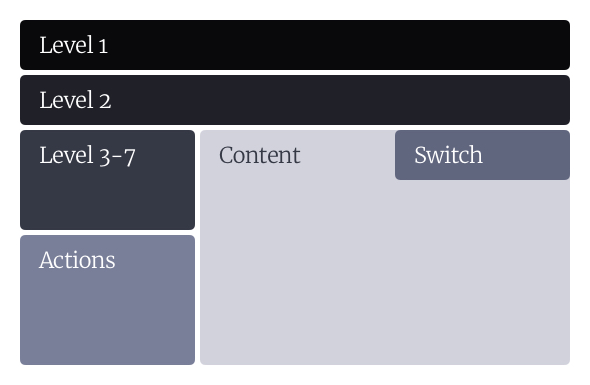
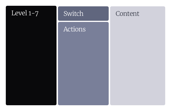
This had an added benefit of clarifying the hierarchy between the different levels of navigation in the interfaces, more clearly differentiating the switch view (Which moves users between different tables of a record) and actions (Which could apply to the record as a whole, or to the individual page). Now instead of wandering all over the page looking for navigation, the user had the ability to just move left to right as they narrowed their scope and specificity.
We began with a thorough heuristic evaluation of the prototype, which surfaced lots of opportunities for small wins and gave us a solid baseline for our success metrics. Version 8 would also be a major technology change for the software, so we had to make a lot of smart guesses and good hedges. ACGI is an agile-ish shop, and so we had a clear knowledge of how much work we could accomplish and in what sort of time frame.
The heuristic evaluation gave us the ability to prioritize changes, giving us a better understanding of what the product should do, and what problems we should be looking to solve in testing. Many of the changes that came out of the heuristic review were relatively simple, straight-forward issues that could be resolved quickly before we got into testing. Others were more difficult, but that early process gave us the ability to plan to accomplish these changes before getting into the greater complexity.
Structure
Improving the product was our #1 goal, but we also wanted to set up the company to do good work faster and with less effort in the future. That was only going to come about by creating a scaffolding for us all to use, in both concept and technology.
I started with a detailed breakdown of our design system in Confluence, giving detailed guidelines on what elements to use and when, and establishing an overall design system for the company. Because of the technology we were using, this system was largely documentation of the decisions we made instead of being a true, living style guide. However, this opened up communication with our developers and engineers about the interfaces that we used, why and when we would pull in specific components.
Much of this was done by collecting together the various ways that we already did the interface design through years of legacy software, documenting the different versions that we saw and unifying them into a single standard. The product department (Greg and I) set up trainings with the engineering staff to teach them usability heuristics and standards, and to get them moving towards making more consistent, understandable interfaces.
Alan and I also oversaw a complete restructuring of the CSS of the application, which we broke down into a modern SCSS framework. It was so truly lovely to throw out buckets of legacy styles, and instead have a cleanly structured, logically arranged files. We went with a structure loosely based on inuit.css, with an emphasis on self documenting style, good modularity, and a reasonable specificity curve (There were a lot of !importants previously).

Testing and Refinement
While we were iterating on building out the first versions of the interface overhaul and technology changes, I created a detailed testing plan that outlined what we would be testing and how. Based off of interviews with various people at ACGI, the product department’s goals for the redesign, and just various bits of information I picked up from working with the product everyday, we outlined about 12 primary questions that we wanted to be able to definitively answer at the end of the testing process (With lots of subtasks.) These were mostly focused on 2 ideas:
- Do users understand the new system? If not, can they learn it quickly?
- Once they understand the space better, is their overall ability to move through the system improved?
Our testing program was with our current partner organizations, testing the interface on users with various levels of familiarity with the system. Our testing plan paid off in spades because we were able to collaborate with our client contacts to find users who had been working with the product for 5 years,and even someone who had just started the week prior.
In each case, I went to the client site, testing scripts and a camera in tow, and did in-person usability tests with each person on our schedule. Overall, we tested with about 25 different people. We instantly learned a few things:
- Dear lord, did the navigation improvements make sense to people. They were learning the new method in minutes when it took weeks to grasp previously.
- Our language and mental models about the navigation were a huge hindrance to the users understanding what we were talking about.
My favorite example of this came from a fairly simple feature we built in at the outset—the ability to collapse the menu and to keep it “pinned” open. After futzing with it for a few months, we were well familiar with the functionality of it, and it would make perfect sense to our users… right?
Turns out that it made zero sense. The menu automatically opened up, so when they saw something that kept the menu open, they just never touched it. We flipped the script—what if the button said “Auto Close” so that you can use a small screen more easily! Now users thought if they click this button it would exit them out of their browser entirely. Thankfully, our iterative testing gave us the ability to make changes through the process, finding small refinements and fixes as problems came up. Eventually, we realized that we could call it “Auto Hide” which when paired with a “Hide Menu” button, made it clear what the function was and how it would work.
Outcomes
At our user conference in 2016, we presented a detailed overview of the changes that were coming to the AA interface in the coming months. Instead of the consternation and concern the initial prototype had generated, instead we multiple clients ask to be part of the beta testing program. We harnessed that momentum into a rigorous bug testing process, that helped us iron out the bugs in the environmental configuration.
Once we had learned that the system was (most likely) usable, now all we had to do was get it live in the client environments!