User expectations are a moving target. We don’t get to develop in a vacuum and whenever we create, we inherit the entire ecosystem of the user. This is a double edged sword. On the one hand we don’t have to start from scratch in building expectations. However, when our fellow designers begin to abuse useful patterns, our users develop bad expectations and worse habits.
Modals suffer an unprecedented level of abuse right now in modern web and app design. It’s part of the attention zeitgeist; Instead of expecting our user to find what they’re interested in we allow our goals to supersede their needs.
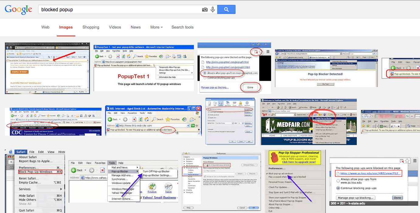
The pattern is upsettingly familiar and the template is the popup. Crucial popups are a risk with the proliferation of blockers, to the degree that sites now must walk their users through the process of allowing the popup so they can find useful information.
Nobody’s paying attention
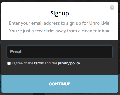
We’re all familiar with the maddening modal, the stupid irrelevant content that pops up over what you’re interested in with an ad or a mailing list. In recent user testing, I watched many high school age users dismiss a modal without even looking at the contents, even after they had triggered it with an interface action. They didn’t know what it was, but they knew they weren’t interested. It set off their bullshit alarm at a subconscious level.
The challenge here lies in the crucial difference between modals and popups. In popups, we found a technological solution. As popup blockers proliferated, we could coach the user through the pattern required to see what they needed. With modals however, there is no technological solution to block them. Instead, we see a behavioral solution, brought about by lack of trust.
How and When to Use a Modal:
We can’t reclaim the pattern, so we’re just going to have to work with our user’s expectations.
1. Never trigger a modal without user input
Arriving on a page is not user input. Do not auto show a modal after your user arrives, especially because asynchronous Javascript means that they’ve already begun navigating by the time the modal loads. This is stupid, bullheaded behavior and deserves mockery. When other people suggest it on your product, shoot it down as brashly and permanently as you can. Call out other people who do it. This is not a drill.
2. Consider temporarily disabling dismissal
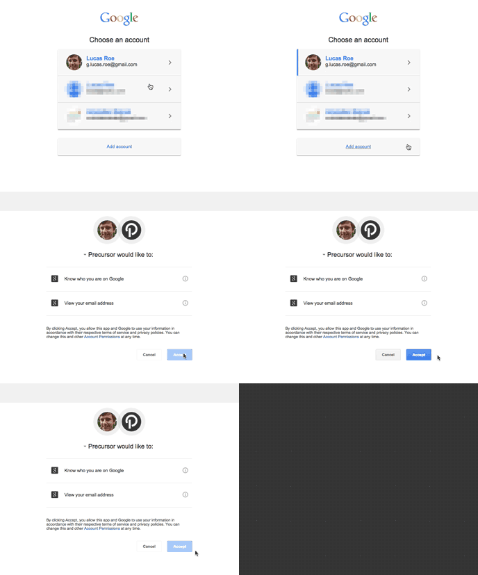
If you put something important in a modal, assume that the user is going to try and dismiss it instantly. Google has been disabling the ability to immediately accept App Permissions and OpenId authentications for the same reason. Keep it just short enough to check the reflex.

Forbes uses a timer to let people know how much longer they have to wait for their content. I think this is silly because it puts the focus on the timer, not the content. I also think it’s silly because it’s completely unrelated to anything I want.
3. Keep your modals insanely targeted
In general, you should be analyzing the hell out of anything you put into your product. When you’re in crunch time and making oversights, make sure it isn’t a modal. Think of it this way, you’re being demanding and overbearing. Make it up to your user by not wasting their time with a ton of verbiage. Make it crystal clear why you’re interrupting them and then get out of the way.

4. Make your modal incredibly easy to dismiss
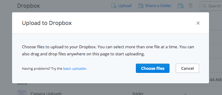
This seems at odds with #2 because it is. Remember, you’re purposefully being rude and interjectory. If the user genuinely doesn’t need what you’ve thrown in their face, make it easy to get rid of. I typically go with three methods, a cancel button, an X in the top right, and a modal background that closes on click.
5. Remember that you’re breaking context
Modals fade out the rest of the page, requiring focus on only its elements. This makes modals dangerous for decisions that require context, like assigning categories, naming things, or even moving things. Truly analyze what context your user will be in when they need to undertake these actions. Would they make more sense in an inline control, which is highly contextual?
This is all temporary:
Evolving user expectations are just one of a multitude of reasons why you absolutely must test with your target audience. This is especially true because some of the very strategies I listed above are already seeing abuse, so we can expect that eventually they will also lose effectiveness. Placing your user’s needs first, validating your theories, and remaining aware of pattern evolution is the only way to assure that you can remain effective.
More Reading:
- Devs rally against mobile web doorslams on Creative Bloq
- I don’t want your f****** app: Examples of “doorslam” modals, usually focused on apps
- On Swearing and UX Antipaterns : Curator of the above Tumblr talking about the response to his project.
- The web needs fewer doorslams and more personality: The same Tumblr curator gets an interview on Creative Bloq
- Google Takes a Stand on Mobile App Doorslams: This is about app interstitials getting penalized on SEO. Not quite the same technology, but the same poor pattern.
- Can Hated Design Elements Be Made to Work?: Jakob Nielsen was very concerned in 2011 that designers would “poison the well” and make it so users hated the “lightbox” pattern. Whomp.
