
Overview:
- Company: r2i
- My Role: Interactive design, high fidelity prototyping
- Project Manager: Lindsey Byroads
- Strategist: Claire Carton
- Designer: Dana Wagner
- Front End Developer: John Velasco
- Back End Developer: Patrick Wilson, Chris DeSautles
- Live Site: http://www.bunn.com/
When I first learned about this project, the image that popped into my head was of the ubiquitous steel coffee machine that pops up at nice places that still comp you coffee, like a hotel or… well a funeral home.
BUNN has been in the coffee game for as long as there’s been a game to have. They focus mostly on business sales, but also have a robust line of high quality home brewers that focus heavily on the taste of the coffee and the consistency of each brew. Their business side is heavily geared on finding solutions for mass serving needs (without losing sight of quality) and covers a range of products.
BUNN came to r2i looking for help in combining their two sites. While they had previously had a business focused site and a consumer focused site, they didn’t feel like it worked well with their larger strategy and message.
Goals:
- Commercial Users vs. Consumers: Previously, BUNN’s content lived in two separate sites. As part of their goal to grow and streamline, they needed to combine the two entities into one, and their website needed to reflect it clearly. Commercial buyers have drastically different goals and needs than home users, so our design decisions must accommodate both.
- Fully Responsive eCommerce: Every website has experienced how mobile traffic has become an incredible portion of their traffic, and it continues to grow. We needed to not just account for mobile users, but consider their acquisition and retention.
- 3rd Party Integrations: While we did have full creative control, we did have a lot of integrations to consider. Working with 3rd parties like WECO (for eCommerce) and SAP (for specifications management), we had a lot of constraints on what sort of data we could pull and use.
Thought Process:
Commercial Users
We spent a lot of time adjusting the categories and reflowing the content under the commercial users section. While we had initially built a traditional sitemap, we found the megamenu approach easier to show the way that the content would be laid out and organized on the final site.
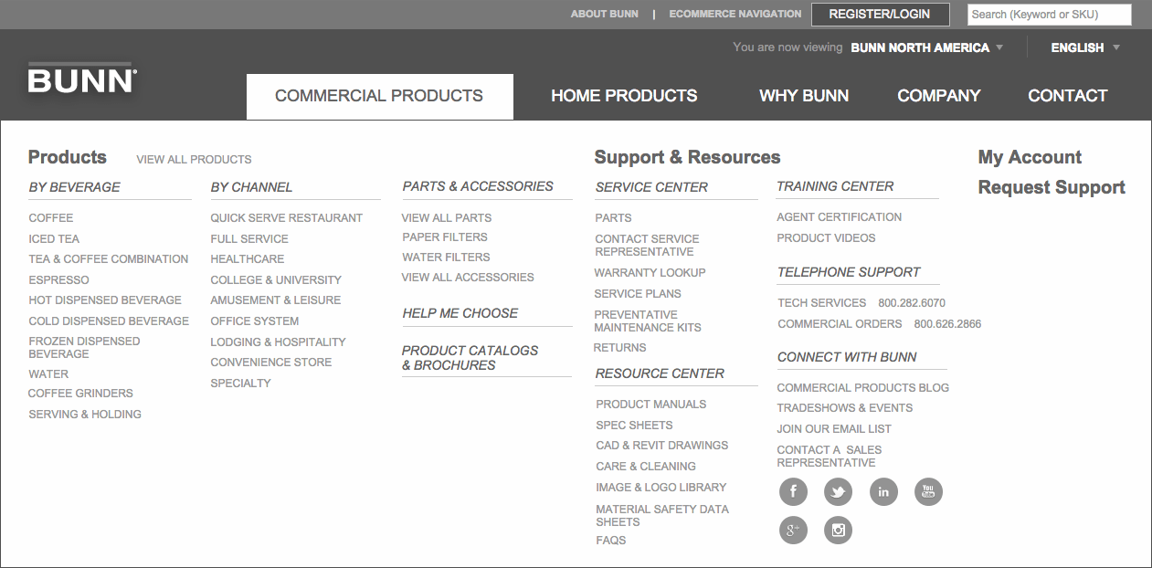
We also carefully defined the way that a user would flow through the store, based on how they got to it. We compared content types and repeatedly came to BUNN with suggestions and questions on how to simplify and streamline the process for their users.
One of our key suggestions was the workflow for users who would come in through a specific channel. Because channels pull multiple types of items, filtering directly against them wasn’t logical. We instead proposed a solution where channels would pull all content types, but require a user to drop into a category before filtering further. Once in a product category, filtering is relevant and is shown to the user.
Home Users
Home users have less to be concerned with because their product line is drastically smaller. Because of this, we focused more on making a bespoke experience, explaining the differences between the types of brewers and helping the user navigate.
Questionnaire
One element that was extremely important to BUNN was the inclusion of a product finder. Their commercial catalog is large, and they were looking for a way to quickly show a user a set of items that was uniquely relevant to them. Enter the Questionnaire.
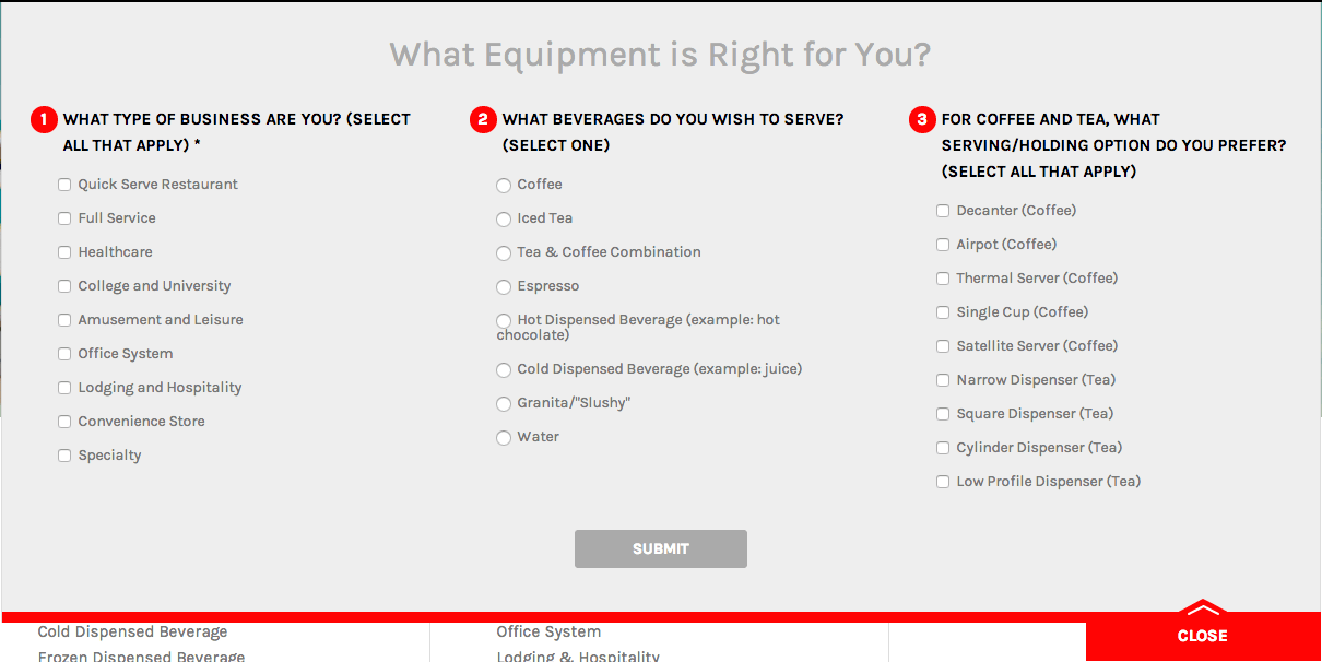
BUNN Proposed a questionnaire to be included on all of the commercial interior pages as a quick jump for the user to find relevant products. A few rounds of revisions on the questions refined the purpose of this feature, making sure it was useful and matching the user’s expectations to their results.
Closing Thoughts:
I swear, I’m not trying to turn everything into Axure evangelism, but the program just works so well. In this case, Axure allowed us to move past a static sitemap and directly show our client how we were organizing information. While this meant that I had to reflow and rewire sections when the IA changed, we found it super helpful in communicating to a large team.
We also spent a lot of time in the Wireframe stage developing and iterating on the IA. Even in a more traditional tiered process, accurate feedback and critical evaluation means that we are constantly improving on the experience for the end user, even when that pushes back into previous deliverables.
We could have rolled over and just allowed whatever suggestions were given to us, but by doing the hard work and collaborating with BUNN by being their contrarian, we developed a better system and hierarchy for their new site.