
Overview:
- Company: no.inc in partnership with Johns Hopkins CTE
- My Role: Research, strategy, high-fidelity prototyping, user testing
- Project Manager: James Hagan
- Visual Designer: Andy Spangler
- Developer: In house team at no.inc
- Live Site: Not applicable, but check out this page on no.inc’s site
When students with disabilities finish highschool, they don’t just graduate. Instead, they have to navigate an entire secondary process known as “Transition,” which weighs heavily on them as they finish their studies. The goal is to find a new environment that suits their unique needs. The process is rarely that straightforward.
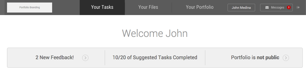
In Maryland, students who go through transition make a portfolio, a document that represents their growth throughout their studies. This document helps tell each student’s story as they transition to their next environment, whether it’s college, a career, or a community setting. The portfolio itself is a thick three ring binder, treasured by teachers but rarely useful for anyone else.
At No.Inc, we collaborated with the Johns Hopkins Center for Technology in Education to make a new, modernized version of the portfolio. We knew that we needed something accessible, flexible, and useful that helped these students tell their stories.
Here’s how we made it.
Needfinding:
We started the project with a series of phone interviews with parents and educators. The most productive conversation was with a teacher named Mr. Lee, who teaches a class focused on the career readiness element of Transition. Attending the class as he worked with students, I observed the problems they ran into while trying to create their portfolio with Google Docs:
- The students were entirely dependent on Mr. Lee to know what to do. Because he was spending the majority of his time running around the classroom, each student had to wait for the entire class to reach a milestone before proceeding.
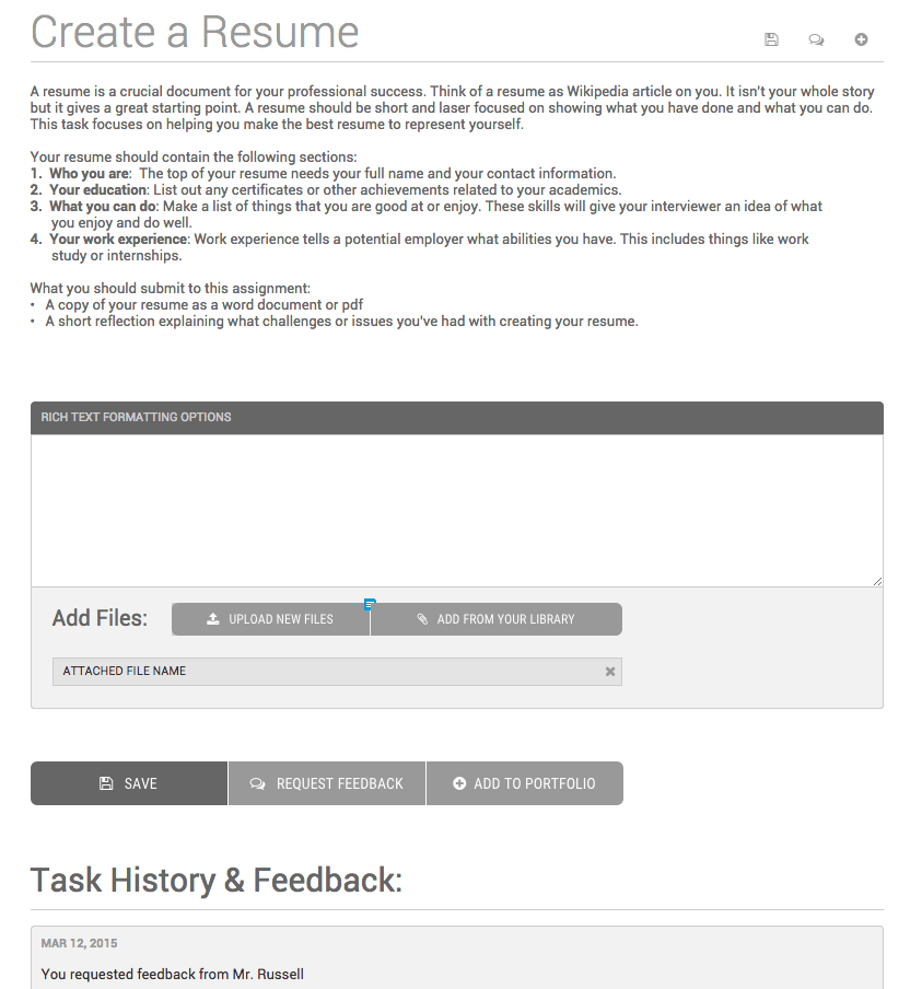
- Google Docs, especially in the framework of Google Drive, confused the students frequently. They became lost easily and had a hard time completing their tasks.
- The students were confused by the assignments they received. They needed a simpler way to walk through the material and to get feedback.
After interviewing some of the students, Mr. Lee, and then a few parents, we established our target users and began planning our feature set.
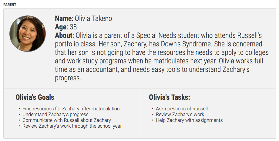
We made personas meant to encompass our main 3 use cases: student, teacher, and parent.
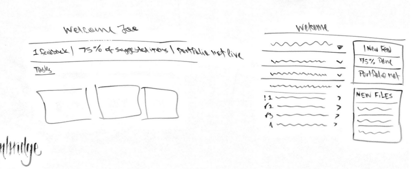
After creating an information architecture based off of our initial feature list and personas, we jumped into a detailed wireframing phase. Because of the timelines of scheduling user tests, we had a month and a half of lag time between our initial interviews and our first round of user tests. We decided testing with a more robust prototype would make the best use of this time.
Testing:
One of the biggest changes that came out of our user testing was our language. Thankfully, our colleagues at Johns Hopkins agreed to come with us and witness the testing sessions. They were stunned at how literally students interpreted our language.
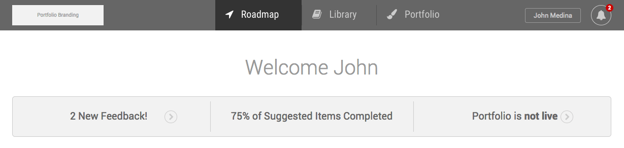
Me: What do you think is in “Roadmap?”
Student: … I guess your GPS?
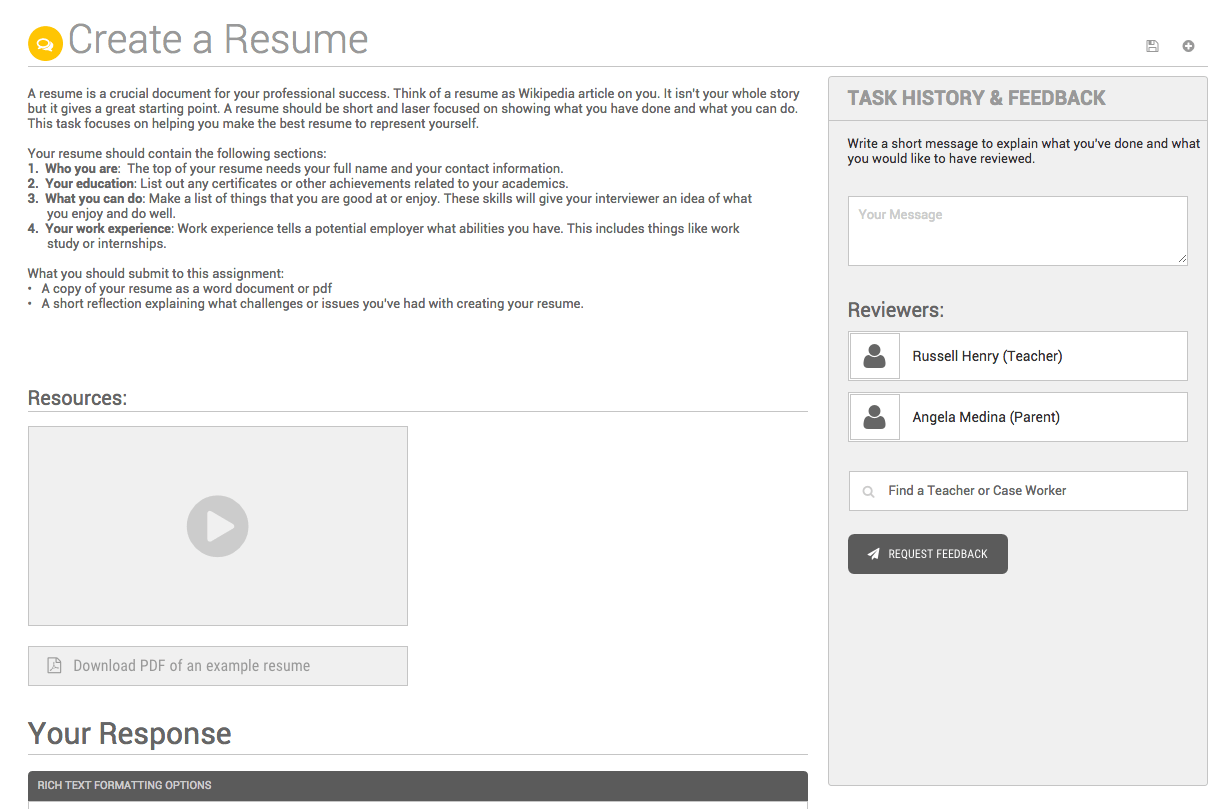
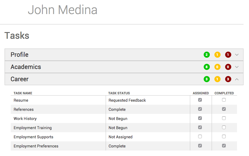
We needed the ability for the students to send notifications to their teachers without the teachers being overwhelmed. Some teachers or case managers could have as many as 200 students as part of their caseload, so we had a delicate balancing act of allowing simple communication while not causing a flood of messages for teachers. This is what drove the design of our feedback system.
We also found that students were afraid of exploration when following direct instructions. Consequentially, we needed very linear paths for them to follow in the system. We rearranged the feedback so it was visible alongside the content, making sure that students realized when they were in the right place.
Between rounds of user testing, we tweaked our questions, the interfaces themselves and our language. We even phased out simpler workflows that students understood more quickly.
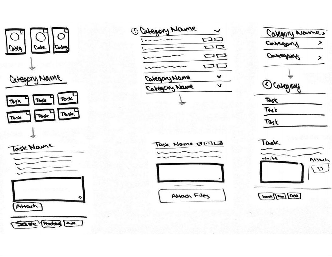
Teacher workflows:
Teachers (or as we ended up calling them, case managers) have far too many tools to deal with as part of their professional life. At every step in the process of designing teacher views, we had to ensure the teacher could accomplish their goals quickly and move on to other tasks.
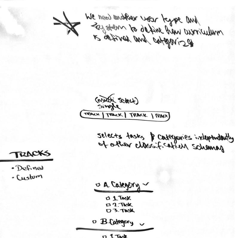
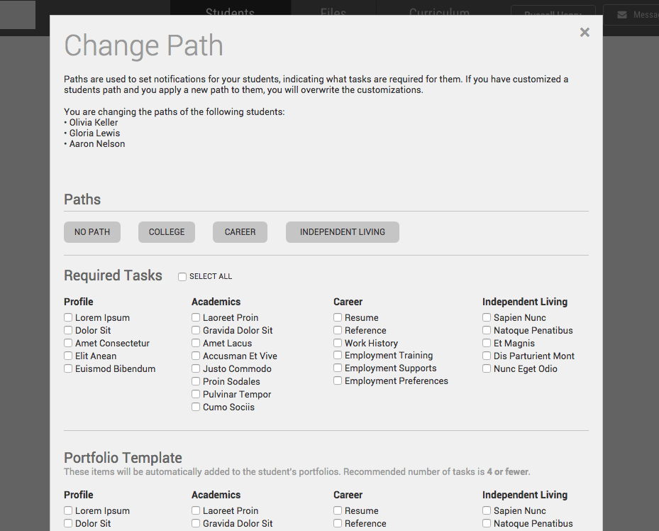
A perfect example of this mentality was the design of “Paths.” While the teachers need very granular tools to manage their student’s assignments, students generally fall into a couple of archetypes. Our proposed solution was the Path, which gives the teachers a quick way to assign students a set of assignments, while also tagging the student as a member of the Path. This gives the teacher a way to find and understand the general makeup of their classroom quickly, while still allowing them to customize curriculum for individual students.
As we worked through the teacher tools, this balance of efficiency and specificity was our constant focus.
What didn’t work:
This project had 2 critical shortcomings as part of its process, but both can be traced to scheduling.
First, our external scheduling with students meant that we weren’t able to test early prototypes, wireframes, and information architecture. This would have been invaluable in helping us find deeper, structural issues with our mental models of the system.
Second, design didn’t include feedback from engineers throughout the design process, to check our assumptions and ensure the technical feasibility of the prototype. Consequentially, we had to make some large changes after we had officially completed our user testing, always a scary prospect.
Overall:
One of the highest compliments that I’ve ever received was from Mark Trexler, a Project Coordinator at JHU CTE and thirty year veteran of Maryland Public Schools. After a particularly difficult test with a largely non verbal student, he told me (paraphrased)
You have the most incredible patience working with these kids. … It’s great to watch them open up and work with you
This project challenged many of my assumptions about how different people understand interfaces, and required me to use multiple techniques to balance the desires of stakeholders and the needs of the end users. Hearing these students tell me their dreams and goals, and seeing the hope that they hung on their portfolio gave so much gravity to the work, but so much satisfaction when they understood how to use it.