
Overview:
- Company: r2i
- My Role: Strategy, interactive design, high fidelity prototyping
- Project Manager: Maria Kelly
- Designer: Tim Frost
- Developer: Shalik Wagle
- Live Site: https://www.funeralmatters.com/
The death of a loved one is one of the hardest things to cope with. Funerals have a tendency to make a difficult time seem impossible. A sea of potential costs crash into a mountain of protective legislation. The result is rarely pretty.
New Jersey State Funeral Directors Association (NJSFDA) reached out to us at r2i for strategic and technical help to develop their new product, Funeral Matters. While they already had a paper form process, they wanted an application for both funeral directors and consumers to help them navigate the complex waters of funeral planning with ease and simplicity.
Translation:
NJSFDA already had a rigorous and well tested product for Funeral Matters, a set of well designed paper forms in a packet. Our first task was to convert these forms into their digital counterparts.
We aimed to streamline the process as much as possible by simplifying complex sections and creating specific interfaces for different steps.
Fidelity:
While NJSFDA was going through the process of developing this product, they also needed a way to test it with their members. This testing also served as a proof of concept to get early backing from their members.
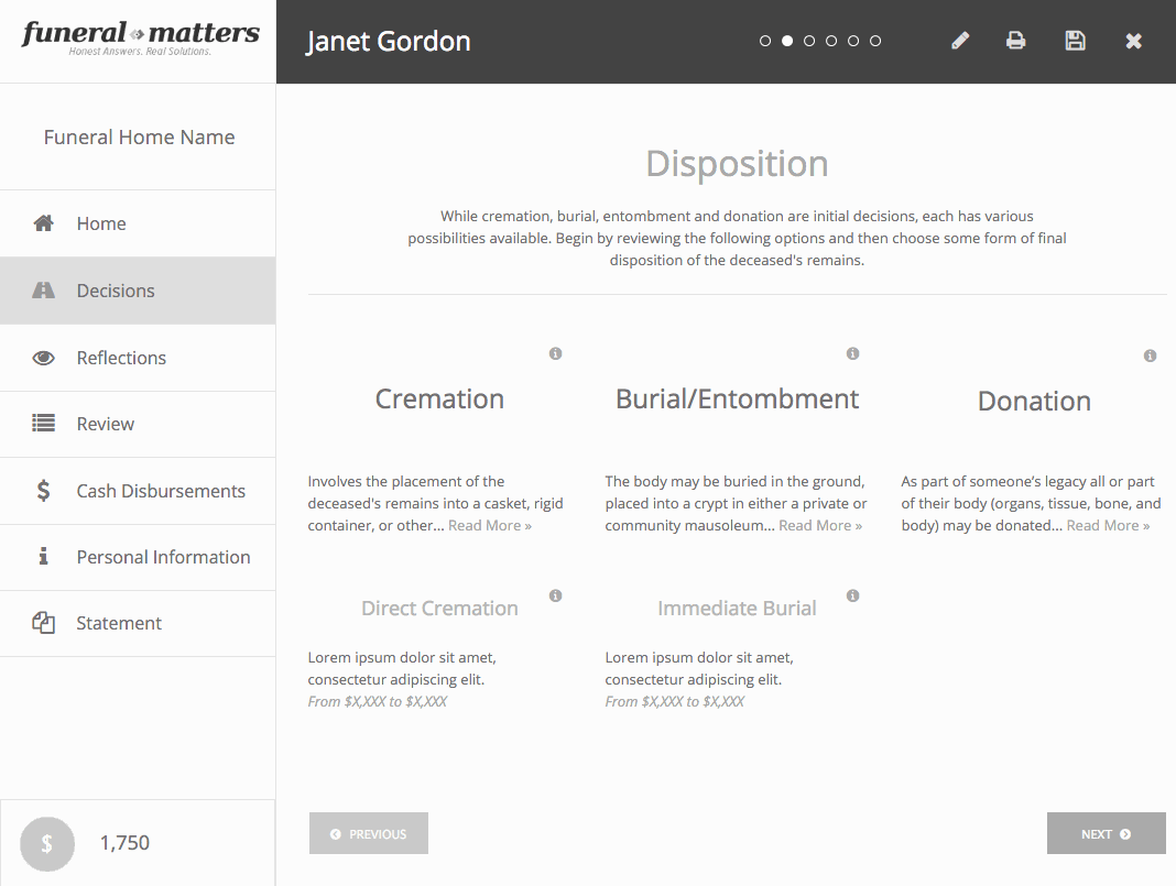
Consequently, our Axure prototypes had to be some of the highest fidelity prototypes that we’d ever produced. The level of detail included making fully functioning menus, navigation, and even conditional logic in the user flow.
Diagramming:
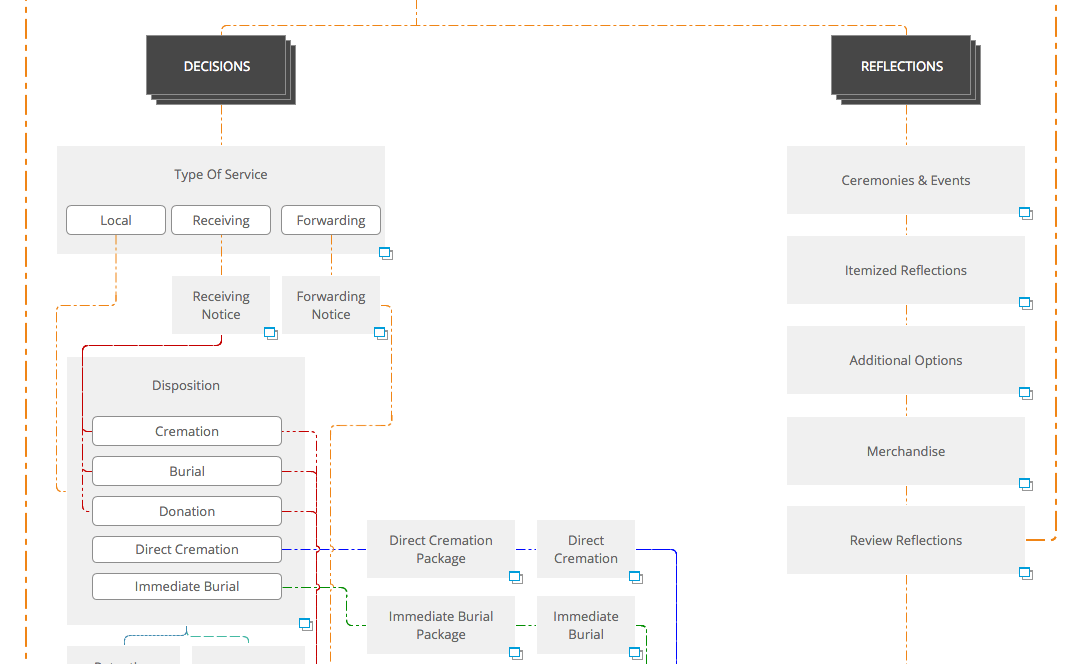
Throughout the process, we had numerous rounds of feedback from varying levels of the organization. Initially, the feedback was simple when we had only a few screens of the interface. We quickly found that the conditional logic of the prototype obscured the underlying structure of the system. After a few rounds of confusion, I created a detailed and annotated flow diagram to show the full process. This document became our key during meetings, showing the value of individual interfaces and how they interacted with the entire system.
User Balance:
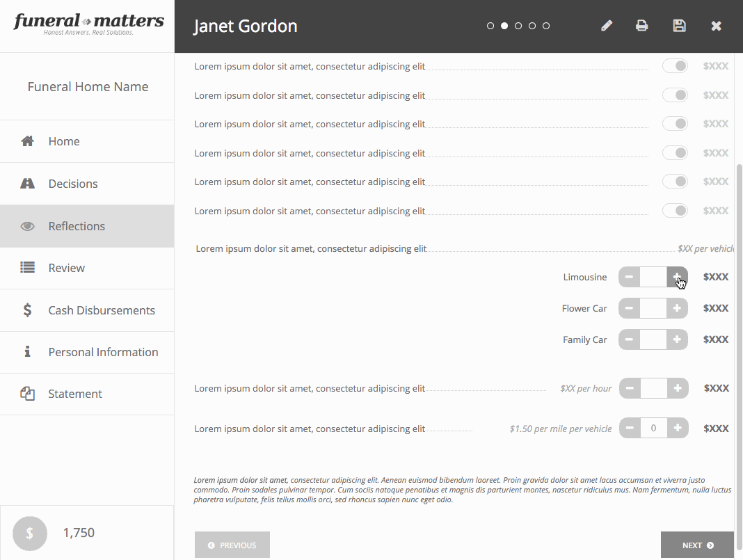
As we developed these interfaces, we always had a constant concern with our navigation patterns. How could we make an interface that was helpful and verbose for new users (end users who were estimating costs after the death of the loved one) and expert users (Funeral directors who would use the site numerous times a day?)
One of our main strategies was to create multiple navigation methods that would guide a new user through the process while allowing the expert user to move freely. Our left hand navigation clearly spelled out the main sections and their children. We also added a subtle dot navigation at the top, giving a small indication of progress and allowing navigation inside of each section. Each section also had on screen navigation buttons that were disabled until the user had selected the relevant information on the screen.
What didn’t work:
The biggest challenge with this project is that we had no exposure to the end users. While one of our clients tested the product with end users and reporting his findings, we didn’t have any way of knowing his testing methodology.
The level of fidelity also ended up becoming a liability as the project progressed. Because of the depth and complexity of the interactions, the length of time spent editing them grew considerably and adding new workflows became difficult. I’ve handled this in more recent projects by taking detailed notes and more annotated deliverables, helping us keep track of the complexity over the course of months.
Overall:
This project was tremendously difficult and lasted for months. The complexities of the industry swirled together with the complexities of the technology, and we spent a lot of time mired in the process and trying to muddle through. We had to be adaptable and flexible, taking on whatever role made sense at each step in the project. The annotations and interface writing became one of my most important contributions, superseding my emphasis on the UI and form components we were using.
This project exemplified that UX design is more about the process than the final project. The shiniest prototype that I could produce didn’t help nearly as much as a simple flow chart.