Overview:
- Company: r2i
- My Role: Interactive design, high fidelity prototyping
- Project Manager: Maria Kelly
- Strategist: Ben Brasso
- Designer: Tim Frost
- Developer: In-house team at Vertafore
- Live Site: http://vertafore.com
Vertafore is a company that provides software to insurance companies, delivering insight, flexibility, and power into the hands of their customers. As they went through the process of redesigning their site, they realized that they had a bigger problem to solve, their brand.
They went the difficult but correct route, restructuring their identity before pressing forward with their site design. We were brought on to help them with an overhaul of their site with a responsive focus, using a combination of their new style guide and adapting their previously designed templates.
Goals:
- New User/Returning User Balance: Vertafore’s main site should be geared towards new users, while remaining useful for current users.
- Product Hierarchy: Vertafore has many products that is has developed and acquired over the years. They have 2 flagship products and then a whole host of smaller products. We needed to provide visibility, separate log-in points, and education for their entire product portfolio.
- Training: Vertafore has an amazingly detailed training section called Vertafore University. Unfortunately, the existing set up was heavily influenced by their scheduling vendor, which left an undirected experience for the end user.
Thought Process:
User Balance:
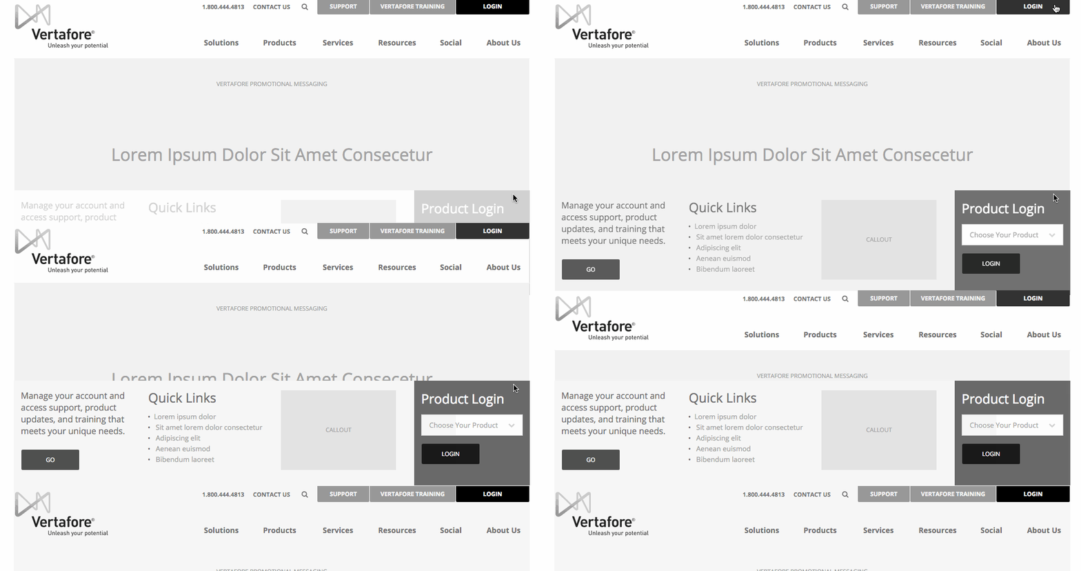
 Returning users know why they’re coming here, so we decided to give them everything utility related in a top nav. Because of how important Vertafore University is, we gave it higher visibility. Because the products have different sign-in portals, we balanced a way to navigate to a specific product login while also give opportunities for quick links, intra-site advertising, and quick access to support.
Product Hierarchy:

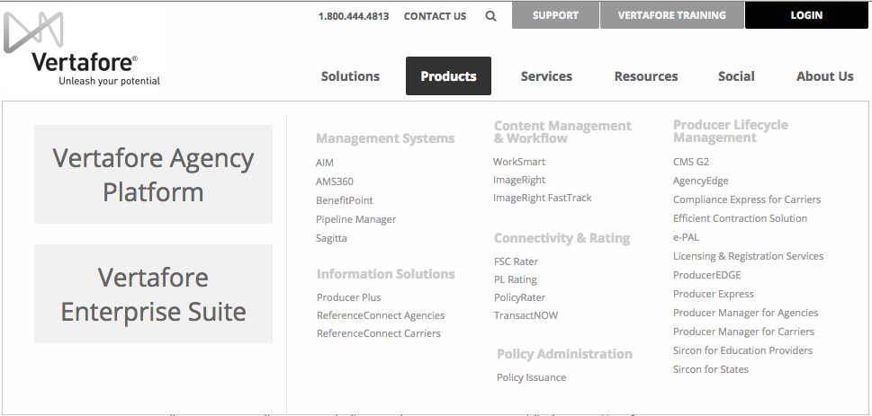
Vertafore broke down their product list for us admirably, so we worked to display it in as simple a manner as possible. We kept an eye on their future goals for their product line to allow consolidation and consistency over time as they improve their product line.
Training:
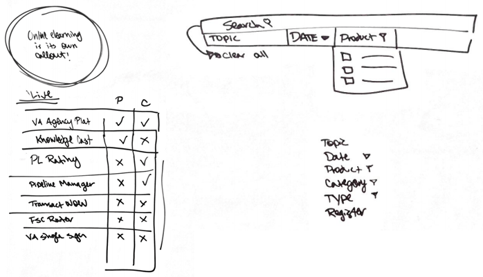
The old training section required a lot of legwork to see everything that was available. While it had been developed to work well with their webinar tool, it required a user to click between multiple pages to compare what was available and usable.
I combed through the numerous types of data and suggested a way to combine and condense them, looking to combine all of the events into a single interface that allowed the user great flexibility in finding the right content. Unfortunately, this solution would have required a complete rearchitecting of the way that Vertafore created their webinars. We kept the reorganization of the different types of training, and moved the different webinar types into accordions.

Closing Thoughts:
UX work is so often a compromise. Frequently the best solution can’t be implemented immediately, so we begin looking for ways to find the best solution we can implement. While some of our suggestions went unused in this initial launch, presenting and proposing them gave Vertafore a next step to continue iterating, improving, and refining.
